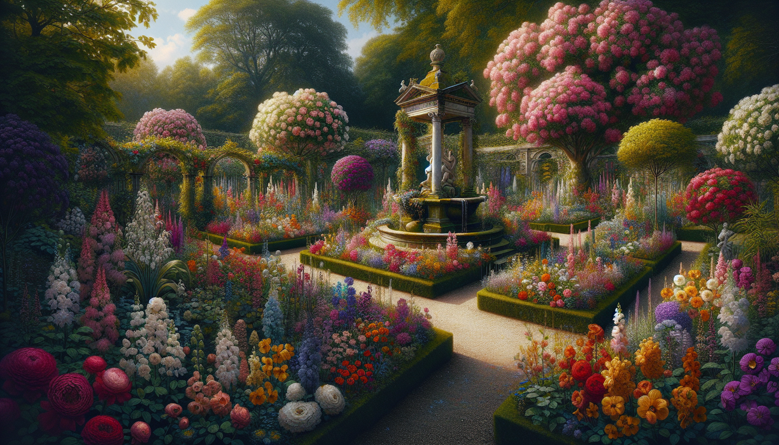
Imagine stepping into a garden where every color harmoniously blends together, creating a picturesque scene that immediately uplifts your mood and captures your attention. In this article, discover a comprehensive guide to color theory in garden design, where you will learn how to expertly combine hues and tones to create stunning floral arrangements and landscape designs. Whether you’re a gardening enthusiast or simply want to enhance the beauty of your outdoor space, this guide will equip you with the knowledge and inspiration to transform your garden into a vibrant and visually captivating oasis.
Understanding Color Theory
The Basics of Color Theory
When it comes to designing a garden, understanding color theory is crucial. Color theory is the study of how colors interact with each other and how they can be put together to create different effects. By learning the basics of color theory, you can make informed decisions about color combinations and create a visually appealing garden.
Primary Colors and Their Combinations
At the core of color theory are the primary colors: red, yellow, and blue. These colors cannot be created by mixing other colors together. Instead, they are the building blocks of all other colors. By combining different amounts of the primary colors, you can create secondary and tertiary colors.
Secondary colors are created by mixing two primary colors. For example, mixing red and yellow creates orange, while mixing yellow and blue creates green, and mixing blue and red creates violet. Tertiary colors, on the other hand, are created by mixing a primary color with a neighboring secondary color. This creates colors like red-orange, yellow-green, and blue-violet.
Color Wheel and Color Harmony
The color wheel is a visual representation of the relationships between colors. It is a circular chart that displays the primary, secondary, and tertiary colors. The color wheel helps us understand color harmony, which refers to the pleasing arrangement of colors in a design.
Complementary colors are located directly opposite each other on the color wheel and create a high contrast when used together. Analogous colors, on the other hand, are located next to each other on the color wheel and create a harmonious blend. Monochromatic colors are different shades and tints of a single color, creating a soothing and cohesive look. Contrasting colors create a bold and eye-catching effect by using colors that are opposite on the color wheel.
The Impact of Color in Garden Design
Psychological Effects of Colors
Colors have a profound impact on our emotions and can evoke specific feelings and moods. Understanding the psychological effects of colors can help you create the desired atmosphere in your garden.
For example, warm colors like reds, oranges, and yellows are energizing and stimulating. They can evoke feelings of excitement, joy, and passion. These colors are perfect if you want to create a lively and vibrant garden. Cool colors such as blues, greens, and purples have a calming effect and can create a sense of serenity and relaxation. These colors are ideal for creating a tranquil and peaceful garden.
Creating Mood and Atmosphere with Colors
By strategically using colors in your garden design, you can create different moods and atmospheres. For instance, a garden predominantly filled with warm colors will feel energetic and inviting. This can be great for social gatherings and creating a lively atmosphere. On the other hand, a garden dominated by cool colors will have a calming and soothing effect, making it an ideal space for meditation and relaxation.
When selecting colors for your garden, think about the type of atmosphere you want to create and choose colors accordingly. Remember that the color scheme should align with the purpose of your garden and reflect your personal preferences.

Choosing Colors for Your Garden
Considering the Existing Landscape
When choosing colors for your garden, it is essential to consider the existing landscape. Take into account the colors of your house, fences, and any permanent structures in your garden. You want to create a color scheme that complements and enhances the overall look of your outdoor space.
For example, if you have a house with a warm-colored exterior, you may want to select plants with warm-colored flowers to create a harmonious and cohesive look. Alternatively, if your house has a cool-colored exterior, you can choose plants with cool-colored flowers to create a calming and unified garden design.
Factors to Consider in Color Selection
In addition to considering the existing landscape, there are several factors to consider when selecting colors for your garden. The climate and sunlight exposure of your garden will influence the intensity and longevity of certain colors. Bright, vibrant colors may fade quickly under intense sunlight, while pastel shades can appear washed out in shady areas.
It is also important to consider the size of your garden. In smaller gardens, intense and bold colors may overwhelm the space, while in larger gardens, they can create interesting focal points. Additionally, think about the mood and atmosphere you want to create in your garden and select colors that align with that vision.
Warm and Cool Colors
Differentiating Warm and Cool Colors
Warm and cool colors have distinct characteristics and can greatly impact the overall look and feel of your garden. Warm colors refer to those that are reminiscent of sunlight, fire, and heat, such as reds, oranges, and yellows. Cool colors, on the other hand, are reminiscent of water, sky, and foliage and include blues, greens, and purples.
By understanding the differences between warm and cool colors, you can use them strategically in your garden to create various effects. Warm colors tend to appear closer and can make a space feel more intimate and cozy. Cool colors, on the other hand, create a sense of depth and openness, making a space feel more expansive and calm.
Applying Warm and Cool Colors in Garden Design
Utilizing warm and cool colors in your garden design can significantly enhance its overall aesthetic. For instance, you can create a focal point by planting warm-colored flowers against a backdrop of cool-colored foliage. This contrast will make the warm-color flowers stand out and create visual interest.
Alternatively, you can create a sense of unity by planting a variety of cool-colored flowers in different shades and textures. This will create a tranquil and cohesive garden design. Experimenting with warm and cool color combinations will allow you to create unique and visually stunning landscapes.

Complementary Colors
Defining Complementary Colors
Complementary colors are pairs of colors that are opposite each other on the color wheel. These pairs create a high level of contrast when used together, making them visually striking. Complementary colors can add vibrancy and excitement to your garden design.
Some examples of complementary color pairs are red and green, yellow and purple, and orange and blue. When these colors are placed side by side, they intensify each other, making both colors appear more vibrant. Complementary colors can be used in various ways in garden design to create a visually striking impact.
Using Complementary Colors in Plant Pairings
One way to utilize complementary colors in your garden is by pairing plants with flowers in complementary colors. For example, planting purple flowers alongside yellow foliage will create a dramatic contrast and draw attention to both plants. This combination can add depth and visual interest to your garden.
Another way to use complementary colors is by incorporating them in your hardscaping and garden accessories. For instance, you can use a red bench against a green hedge, or place blue accents in a garden with orange flowers. These combinations will create eye-catching focal points and bring a sense of balance to your garden design.
Analogous Colors
Understanding Analogous Color Schemes
Analogous color schemes involve using colors that are adjacent to each other on the color wheel. These colors share a similar undertone and create a sense of harmony and unity. Analogous color schemes are pleasing to the eye and can create a balanced and cohesive garden design.
For example, an analogous color scheme could consist of various shades of purple, blue, and green. These colors work well together because they have a similar cool undertone. Analogous color schemes are versatile and can be used to create a soothing and visually appealing garden design.
Creating Visual Harmony with Analogous Colors
To create visual harmony with analogous colors, you can plant flowers in shades that gradually transition from one color to the next. For instance, you can plant purple flowers near blue flowers, which then transition into green foliage. This creates a seamless flow of colors and a sense of unity in your garden.
Another way to utilize analogous colors is by incorporating them in your garden accessories and decorative elements. Choose pots or garden decor in shades that complement the analogous color scheme of your flowers. This will further enhance the visual harmony in your garden design.
Monochromatic Colors
Utilizing Different Shades and Tints
Monochromatic color schemes consist of various shades and tints of a single color. This creates a harmonious and soothing look in your garden. Monochromatic color schemes are elegant and can create a sense of serenity and simplicity.
To utilize monochromatic colors in your garden, choose a dominant color and then select different shades and tints of that color. For example, if you choose purple as your dominant color, you can include flowers in lilac, lavender, and deep purple. This creates a cohesive and visually appealing look.
Achieving Balance with Monochromatic Colors
Monochromatic colors can create a sense of balance and calmness in your garden design. By maintaining a consistent color palette, you can draw attention to the unique textures and shapes of the plants in your garden. This allows for a more focused and serene experience in your outdoor space.
To add depth and interest to your monochromatic color scheme, you can also incorporate foliage with different shades of green or gray. This adds variation while still maintaining the overall monochromatic look. The key to achieving balance with monochromatic colors is to carefully select different shades and tints to create a visually engaging garden.
Contrasting Colors
Choosing Contrasting Colors
Contrasting colors create a bold and eye-catching effect by using colors that are opposite each other on the color wheel. The high contrast between these colors creates visual excitement and can draw attention to specific elements in your garden design.
When choosing contrasting colors, it is important to consider their intensity. Pairing a bright, vibrant color with a more muted or neutral color creates a strong contrast. For example, pairing red flowers with a backdrop of green foliage creates a striking contrast. On the other hand, pairing two intense and vibrant colors together can create a visually overwhelming effect.
Enhancing Focal Points with Contrasting Colors
Contrasting colors can be used strategically to enhance focal points in your garden. By placing plants with contrasting colors near each other, you can draw attention to specific areas or features. This can be particularly effective when highlighting architectural elements, such as a trellis or an entrance.
You can also use contrasting colors to create depth and perspective in your garden. By placing plants with warm-colored flowers in the foreground and plants with cool-colored flowers in the background, you can create the illusion of distance and give your garden a sense of depth.
Colorful Plant Combinations
Using Color for Seasonal Interest
Using color strategically in your garden can provide seasonal interest throughout the year. By selecting plants with different bloom times and colors, you can ensure that your garden remains vibrant and visually appealing throughout the seasons.
For example, planting early-blooming flowers with bright colors in the spring can create a sense of renewal and freshness. As the season progresses, you can transition to flowers with warmer and more intense colors. In the fall, you can incorporate plants with deep reds, oranges, and yellows to create a cozy and autumnal atmosphere.
Color Blocking and Layering in Plantings
Color blocking and layering are techniques that can be used to create visual impact and depth in your plantings. Color blocking involves grouping plants with similar colors together to create bold and vibrant sections in your garden. This technique can create a dramatic and eye-catching focal point.
Layering, on the other hand, involves placing plants with different heights and colors in front of each other. This creates depth and visual interest by presenting a combination of colors at different levels. Layering allows you to maximize the space in your garden while creating a visually pleasing and dynamic design.
Colorful Accents and Accessories
Adding Pops of Color with Garden Decor
In addition to using plants, you can add pops of color to your garden design with the use of garden decor. Garden decor such as sculptures, birdbaths, and wind chimes can be painted in vibrant colors to create focal points and add visual interest.
You can also incorporate colorful accessories like garden flags, cushions, and outdoor rugs to bring additional color into your garden. These accessories can be easily changed according to the season or your personal preference, allowing you to constantly refresh the look of your outdoor space.
Using Colorful Containers and Pots
Colorful containers and pots are another great way to introduce color into your garden design. These containers can be painted in bright and vibrant colors or come in various shades and textures. Choosing containers in complementary or contrasting colors can create a striking visual impact.
By selecting containers and pots that match or complement the color scheme of your garden, you can create a cohesive and visually appealing look. Use these containers to showcase your favorite plants and flowers, and experiment with different combinations to create unique and eye-catching displays.
In conclusion, understanding color theory is essential when designing a garden. By learning about primary colors, color combinations, and color harmony, you can make informed decisions about the colors you use in your garden. Consider the psychological effects of colors, the existing landscape, and the desired mood and atmosphere in your garden. Explore warm and cool colors, complementary and analogous color schemes, as well as monochromatic and contrasting colors. Use color strategically in plant combinations, accents, and accessories to create a visually stunning and harmonious garden. With a solid understanding of color theory, you can transform your garden into a vibrant and captivating outdoor space that reflects your personal style. Happy gardening!